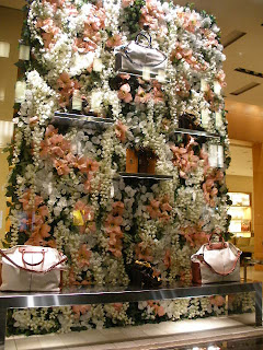
A very overpowering window from Tod's. While in concept I do like it, they execution of the wall of flowers is so overpowering you can not even see the very product that they are featuring. A nice solid backdrop behind each handbag, wallet or footwear would do the trick- allowing the eye to focus on the product and not the thousands of flowers. The wall of ivy is for their Men's line. I will have to give them the quality of the artificially flowers is "tod" notch!...
Sunday, June 2, 2013
Subscribe to:
Post Comments (Atom)


No comments:
Post a Comment