Monday, September 26, 2011

Thread of color...


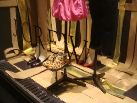
For their "Show Your Colors" campaign, Madewell creates great windows with a backdrop of spools of thread. Each window is broken down into color stories. The forms have many layers creating great texture. Simple, clean and to the point. Nothing thread bare about this...

Attack of the children...


The latest What The Window? comes to us from The Gap. They  are just ugly. Using large cutouts of kids that were shot out of proportion (and if it was intentionally created to be artsy- it does not read that way.)  Then there are the nasty cut outs of the cars and that SALE sign...and top it off with a "bubble quote" from one of the kids, that is ten feet away from their cut outs that are falling over... this is a What The Window &^*($!!!??

Old Friends on a fishing trip...


J Crew creates a window dedicated to their higher end Men's collection: Wallace & Barnes.  Designer Frank Muytjens says the line is based on the vintage pieces that inspire him and he aims to replicate them with the best materials and details. The name comes from an old photo Muytjens found of two men fishing. Written on the back was "Wallace and Barnes, 1928." (Valet.com). This window has an incredible creative way to display the assorted apparel:  the strings tied across in angles. I am also so glad to see a real wood background vs. photo graphic of wood. Brilliant!

Weaving the way...


J Crew creates the latest window with paper strips creating a large woven pattern on the back wall.  The tag line pulls it all in perspective "Weave together: The Perfect Look"  I love how the weave is in the corner and just not the back and how the ends continue  under the forms. This could have ended up like a home craft project, but it "weaved" together perfectly!! 

Thursday, September 22, 2011

Understated...


A new colorful window from the world of Kate Spade. "Understated is Overrated" Bright and Bold and a great send off for Fall. Spade does an incredible job of completing tying the initiative from windows, to store layout always with a strong product focus. One of the graphics for "overrated" does need an extra wire support to prevent the bowing in the middle.  Don't over rate!

Body mist...


Burberry launches their newest fragrance "Body". A huge graphic image of a woman naked in a Burberry trench coat with hundreds of bottles hanging around and spill across the floor. Love this window; it's a classic old school display window for a fragrance launch!

Two sheets to the wind...


Artist Daniel Arsham creates the latest windows for Dior. A beautiful white molded " sheet" blows across a chair with a beautiful pink Dior shoulder bag placed on top. In the other window, a "sheet" clings to a mannequin.  So realistic, it is hard to believe that it is solid. Sheetacular!

Monday, September 19, 2011

Snow white turtle doves...


Hermes creates pure white windows, accented by trees with little birds. Great printed wall paper gives a great texture to the starkness as well as additional textures and pops of color from the mannequins. I love this window, but think a time frame in January or February with winter white a little more seasonal although the little leaves on the floor speaks to Fall.  As always, I love how Hermes Home is always spilling out across the floor.

Bird's eye shoe...


Bergdorf Goodman uses a clever way to showcase the opening of their Shoe Salon on the second floor. Using the actual design floor maps as the backdrop, mannequins are attached sideways to the wall to give that "above view" looking down. The use of the shoe boxes, tissue and loose shoes completes the details of a shopping adventure for new footwear. The entry alcove used piles of shoe boxes and mannequins to complete the story inside the store as well. Great foot forward!!

Follow the leader...


The new Fall windows from Louis Vuitton.  Hundreds of mini figures surround the mannequins walking up and down staircases. Very impactful, although the black outfits have a hint of a dominatrix movie usher.