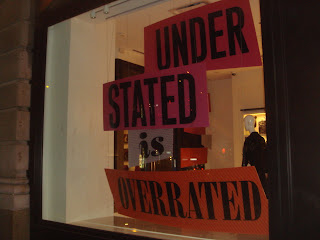
A new colorful window from the world of Kate Spade. "Understated is Overrated" Bright and Bold and a great send off for Fall. Spade does an incredible job of completing tying the initiative from windows, to store layout always with a strong product focus. One of the graphics for "overrated" does need an extra wire support to prevent the bowing in the middle. Don't over rate!
Thursday, September 22, 2011
Subscribe to:
Post Comments (Atom)


No comments:
Post a Comment