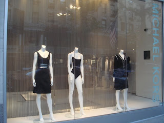
Micheal Kors... black and white is classic and very NYC -- however sometimes simple needs more -- the mannequins are spread apart apart too much and lack of a focal point -- maybe adding a prop like a large closed umbrella to complete a resort theme...
No comments:
Post a Comment