Showing posts with label Banana Republic. Show all posts

Tuesday, February 17, 2015

Love me, love me...

Banana Republic creates a Valentine's window that I am not loving.  Nice in thought with pink post-it notes to fill a chalk heart outline, but I hate all the saying on the notes - assuming of what "we love". The mannequins are just dropped in the window on each side. Wish there was more asymmetry, of course, it is about "love" so the pairs of mannequins makes sense, but I would have liked a platform to give some depth and maybe two sets on one side and a pair on the other. The beige color story is boring. It does not need to be red, but some color would help give warmth and love to this window. Breaking my heart ...


Monday, December 31, 2012

Red again...

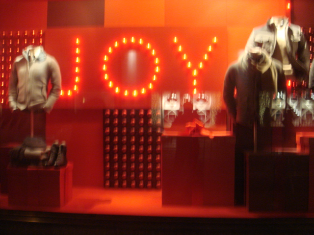
Keeping with a reoccurring holiday theme, Banana Republic once again using red background a repetition of props for their Holiday windows.  I do like the large lighted signage, but the boxes of ornaments with graphic and mannequins is starting to feel tired... even when it is new.


Sunday, November 13, 2011

Punch of Red...


Here are some of the BEST windows I have seen from Banana Republic in a long time! Highlighted with a red wall, multi-holiday themed props are used in repetition; Candy, nutcrackers, ornaments - certainly nothing original, but incredibility holiday-esqe and festive.  Here is to a better 2012 in windows for BR!

Tuesday, August 16, 2011

Mad, Mad, Mad, Mad world...


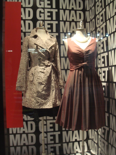
Banana Republic creates windows that pay homage to the TV program "Mad Men". I do enjoy the show, but with contract disputes it will not air new episodes until 2012... did BR plan a window for a time frame that did not include a date change?  It appears to miss the mark for the window when the buzz about the new season is not for another six months.  I do love the large Mad graphics -- very impactful. I wish that they used full forms or mannequins vs the bustform to allow the 50's era suits to be shown to their best light.

Sunday, July 31, 2011

"Shake" shack...

Banana Republic creates a great backdrop of shingles ( shake) that speaks to summer. The hanging apparel has a great composition and balance.  I just wish at the flagship locations the walls were real shingles and just not the photo backdrop. Shake it to me!

Sunday, February 13, 2011

A faded Bloom...


Twenty years ago, department stores created huge window devoted for the launch of a new fragrance. Time has changed. This is a sad little window for a new perfume. The bottles on the floor are too low beyond the consumers eyes. Why didn't they use a few risers or pedestals?

Wednesday, April 21, 2010

Color blind?

Isn't it funny at Banana Republic with a tag line like "Hello Color" that a mannequin would be dressed in a beige suit against a pale yellow square against a beige wall... just saying...